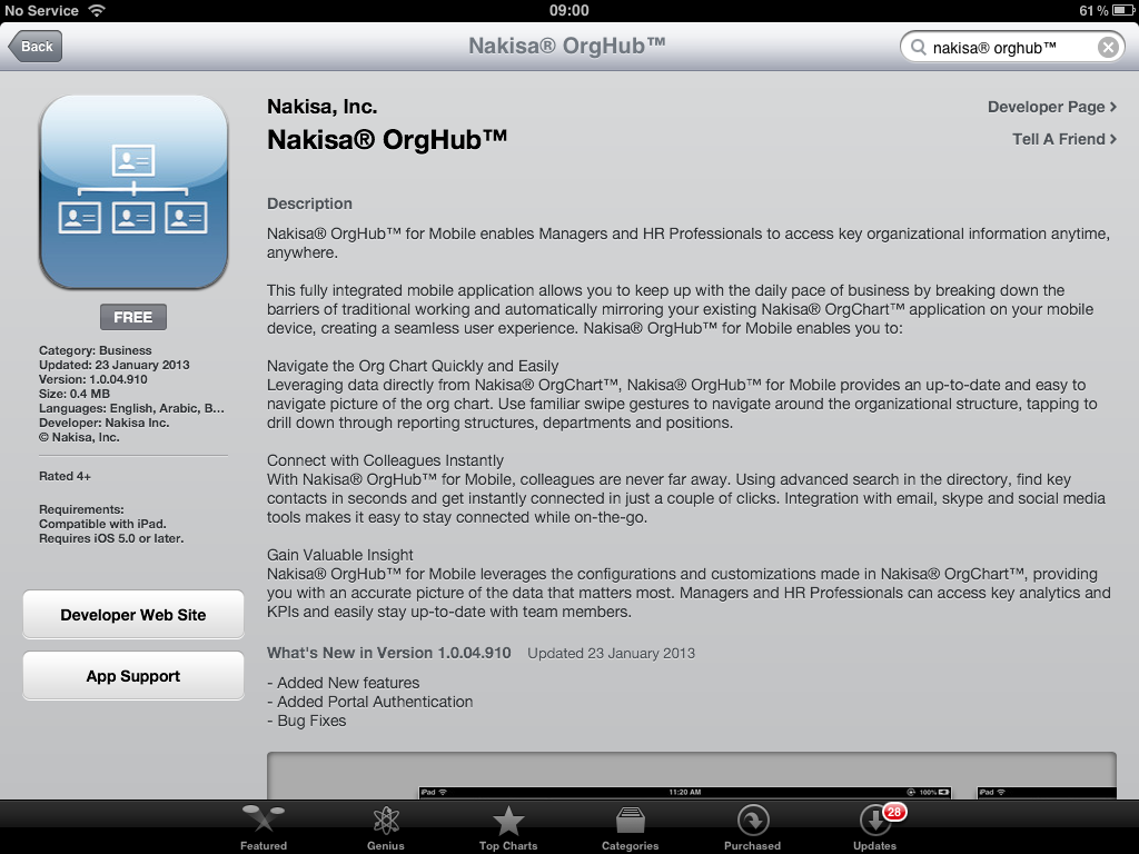
Hands on with Nakisa OrgHub for Mobile
30 Jan 2013Today Nakisa formally launched their new OrgHub for Mobile application onto the Apple App Store. It seems every man and his dog seem to be developing mobile applications to serve up corporate data and services, so how does this new application stack up?
In this post I aim to give you my thoughts and experiences of working hands-on with this application and to give you a view of the usability and features. I’ve included an entire gallery of actual screen shots so you can get a feel for what is available in case you don’t have access to the necessary hardware to test run the application for yourself. In fact there are so many screen shots used that I had to split this into two SCN posts. I guess that’s what you get for working with visualization software!
The Basics
So what do you need to have in place in order to use the application? Well you need the following things.
- An Apple iPad (running iOS 5 (or higher)).
- An OrgHub for Mobile enabled SOVN OrgChart installation.
- Network connectivity between your iPad and OrgChart system (e.g. an Internet connection over VPN).
- The OrgHub for Mobile application.
Fortunately Nakisa have been kind enough to provide a Demo system and the application itself is absolutely free (the cost of use is based on per user licensing on the target system), so all you probably need is an iPad.
The application is available on the Apple App Store, so you can follow the link below on your iPad to access the application.
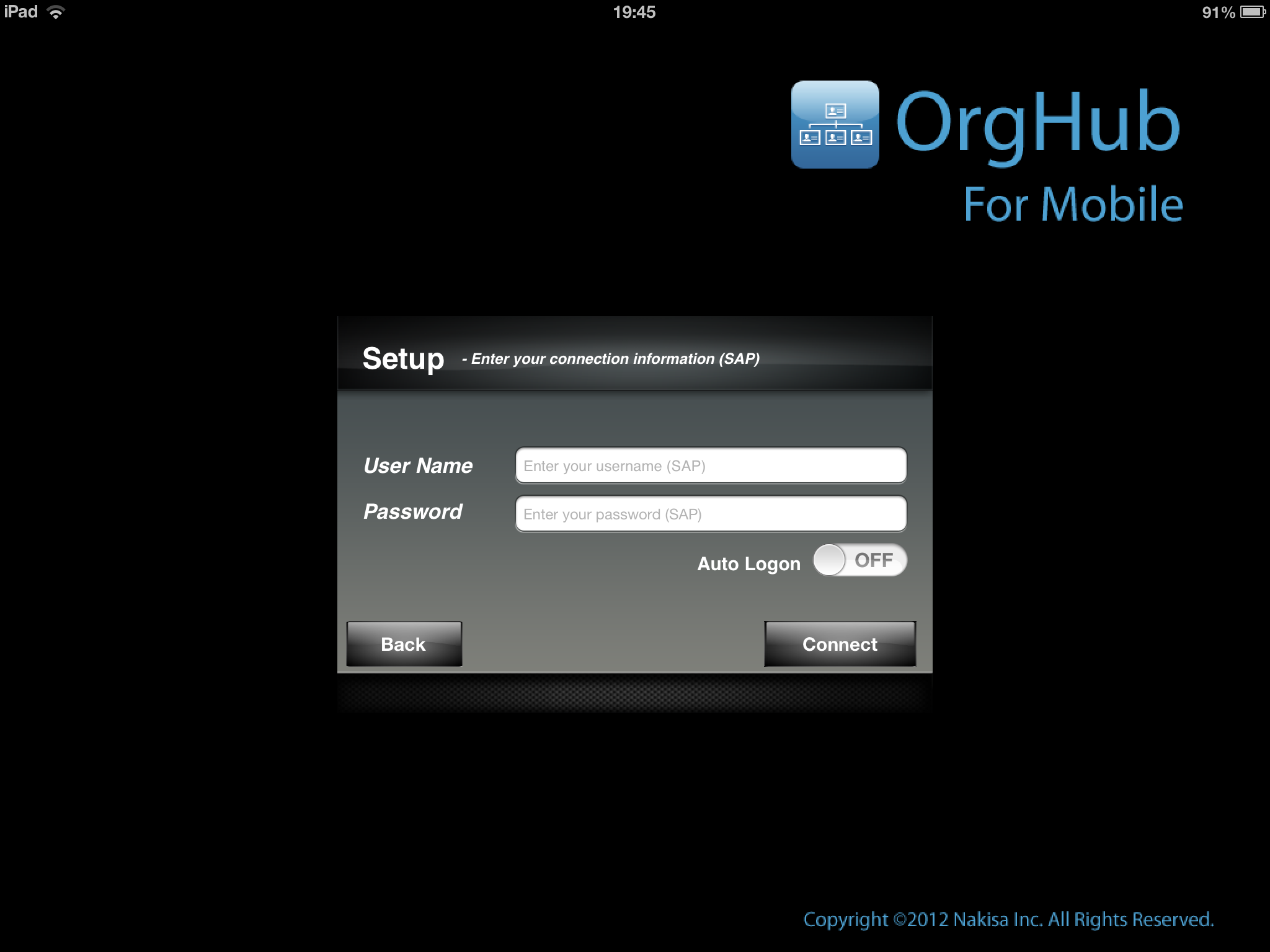
Once you have installed the application and open it you are presented with an option to connect to the Demo system or to connect to your own.
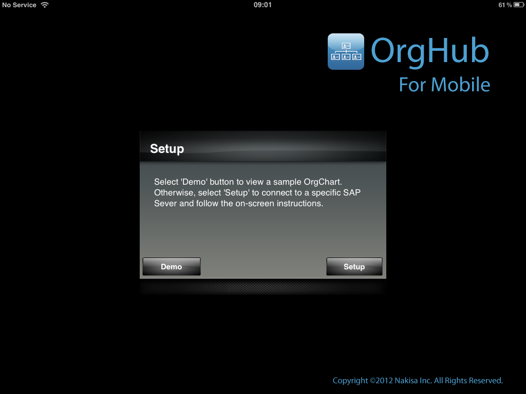
Unfortunately I don’t have a system of my own and at this moment in time very few people will. In fact if you want to get started using your own version you’ll definitely need to contact Nakisa or a Nakisa Partner at this point. So based on that I opted for the Demo system option. Selecting this automatically logs you into the Nakisa Demo system. However if by the time you read this you do happen to have access to your own system, then you can configure access to that from the iOS Settings application.
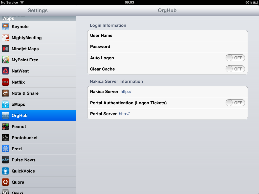
Notably this provides you with an auto logon option, so if you have access to sensitive information via the application you may wish to think before you enable that option.
Getting Started
When the application first opens it defaults to showing (as you might expect) an org structure chart. The particular hierarchy will be the same as that specified in the OrgChart configuration. In fact any configuration in the source OrgChart system (addition/removal of fields, defaults, caption changes, etc.) should be reflected in the OrgHub for Mobile application.
However I’m going to set aside digging any deeper into the chart functionality at this point to cover something important. I’m very much the kind of individual who likes to research first rather than just jumping in blindly. So whilst I will admit that the application is very natural and easy to use I’d like to take a few moments to highlight a very special feature. It’s known in IT circles as ‘Help?
The application does include a handful of help screens. They are accessed by tapping on the large question mark in the top right of the screen.
The first help screen provides a list of icon and box colouring definitions. This is very similar to the one available in the desktop browser application but cut down to match the OrgHub for Mobile interface.
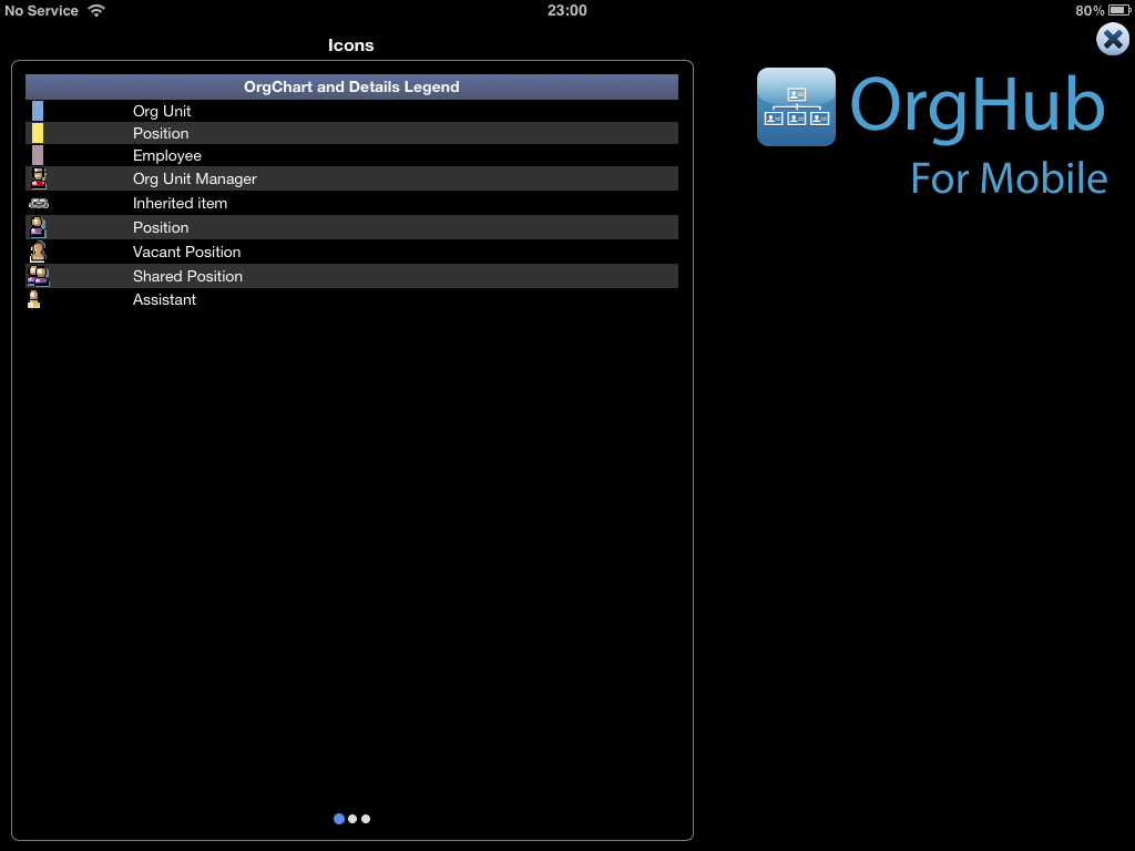
The list isn’t an exact match to the standard list I might expect to see in OrgChart, but then again it doesn’t need to be. This is listing the items in use in the mobile application after all.
That being said occasionally when customising an OrgChart installation you need to do things like add additional icons. So how do you get these into OrgHub for Mobile? Well it’s a relatively straight forward task of amending an XSL file.
If you notice at the bottom of the screen, there are three dots. One blue followed by two white. These indicate what screen you are on and you’ll see these cropping up in other parts of the application too. On the right of the screen you can see the OrgHub for Mobile logo. This part of the screen is inert. Only the help panel on the left of the screen is active, so if you swipe from right to left within this you’ll arrive at the second screen of help.
The second screen describes the gestures available in the application. I found this useful as when I first came to use the application I had some incorrect preconceptions about how I expected the application to work. I had imagined pinching and zooming would be the way you moved around a chart and pressing and dragging would manoeuvre the chart around. In effect I was expecting something very similar to the sorts of mouse gestures I might employ in the desktop application.
However the navigation gestures and indeed the chart layout methods are a little different to the desktop browser version. Now this isn’t a bad thing. In fact I think it shows that Nakisa have given much more consideration to it than I had at the point at which I opened the application. The application has been designed as a tactile mobile screen sized experience and hands-on it seems to work pretty well. So what are these gestures?
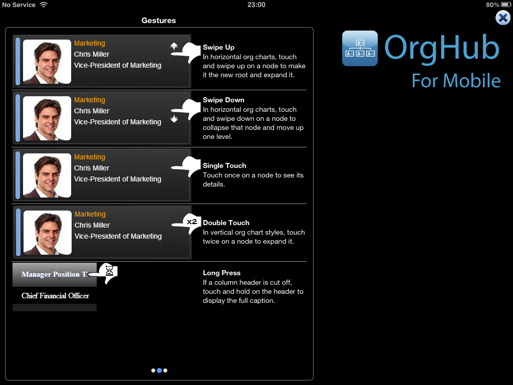
- In a standard styling (more on stylings later) to make a box the root node of a chart swipe it up to the top of the screen. This part of the screen is only ever occupied by one box. If you have a vertical styling there isn’t really a top part of the screen, but swiping a box to the top ultimately has an equivalent effect.
- Swiping a box at the top down will set its parent to be the root node.
- Tapping once on a box will show its details panel.
- Double tapping a box (in a non-assassin way) on a box in a vertical styling will ‘expand’ the chart structure to reveal the boxes at the level beneath the box tapped. Unlike the standard styling, this will actually leave all of the previously shown boxes visible.
- The last gesture wasn’t one I think you would easily guess, but sometimes you can get listings column headings that are truncated by the column width. If you’re not sure what they are, press and hold to display a little pop-up.
So that’s the navigation gestures they tell you about, but here’s some more that might be obvious and/or useful.
- When a details panel is shown for a box or listing entry, tapping another box or item will load in the details for that object. To hide the details panel tap on the dark grey application background. This is easy for a chart as there is always lots of background visible. On a listing, look just outside the edge of the listing itself.
- When a details panel is shown you can swipe it closed by swiping the left edge of the panel to the right. Now I did find this tricky and I know it isn’t just tapping a chart background first as I’ve actually done this over both org unit and position boxes. To bring the panel back, look on the very edge of the screen and you’ll see a glow (in charts) or a bar (in listings). If you swipe this to the left the details panel for the last viewed object will be revealed.
- When an org chart is vertically styled you can scroll the chart up and down by swiping up and down (respectively) on the chart background.
- When an org chart is using the standard styling, the bottom two thirds of the chart can be scrolled up and down by swiping up and down (respectively) on the chart background.
- In listings, swiping up, down, left and right will scroll and pan the listing to reveal more data (left/right) for the listing items or more listing items (up/down). Twelve items are shown per screen so if you have big sets of search results you’ll do a lot of scrolling, but it uses a nice rebound scrolling effect and it is pretty effortless to do in the application.
The third help screen appears to be a little bit of a let down. It simply states - ‘If you are experiencing any difficulties with the application, please contact your company’s IT department?
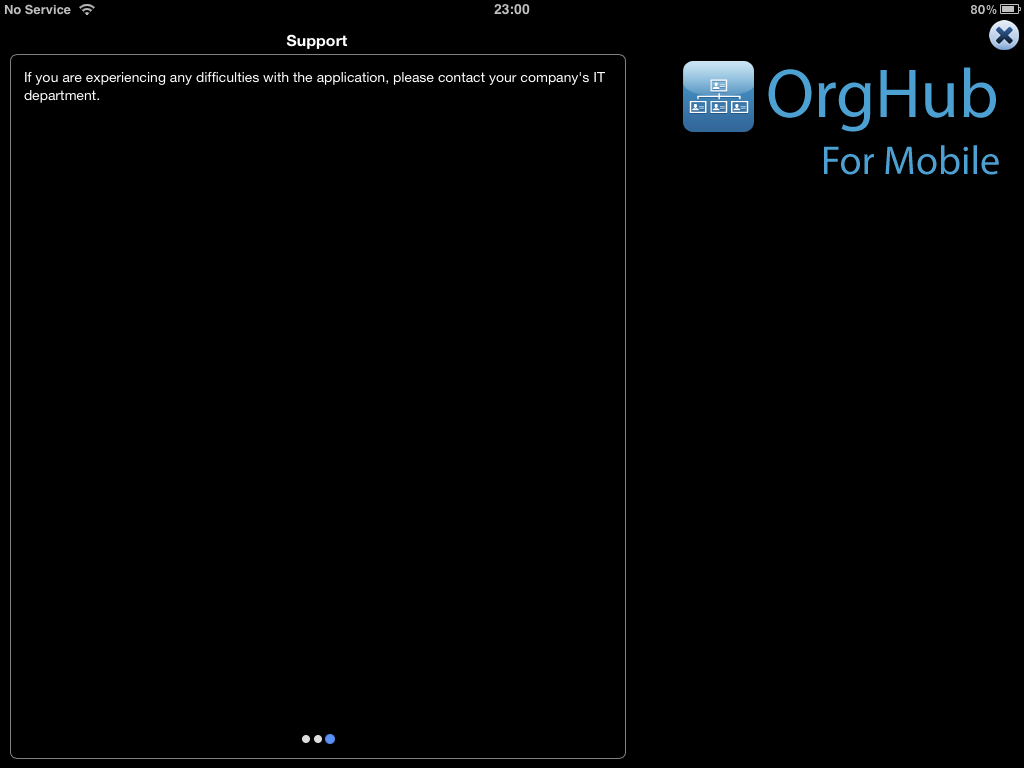
As help text goes I think most people could figure that one out for themselves. However you can modify this text to something more appropriate for your organisation. It is simply a case of amending one of the captions within OrgChart (a relatively simple administrative task).
It would be really useful if this were cached locally upon a successful logon so that in the event of it being a connectivity issue the details could be put up instead of just a message about there being no connectivity. In fact a little ‘diagnostic and technical assistance’ page would be even better! I noted in an earlier App Store release of the application, there was a micro-bar chart that seemed to be measuring a heart beat back to the OrgChart server. This sort of thing might be handy to have or log to a diagnostics page - but then again I’m probably not a typical user.
To exit out of the help just tap on the nice big (I’m sure that was smaller in the first App Store version) cross in the top right of the screen to be returned to the main application.
At the bottom of the main screen are two large buttons - OrgChart and Directory (a.k.a. Listings / Search). So let’s start taking a look at the real functionality of this application. Let’s look at some org charts.
Chart Run Down
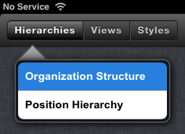
The charting functionality in OrgHub for Mobile has familiar (for those of you who have used the OrgChart application) viewing options. Three buttons adorn the top bar. These buttons when tapped reveal drop down menus.
Active menu options are highlighted in blue.
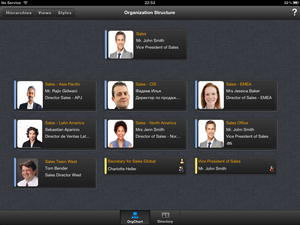
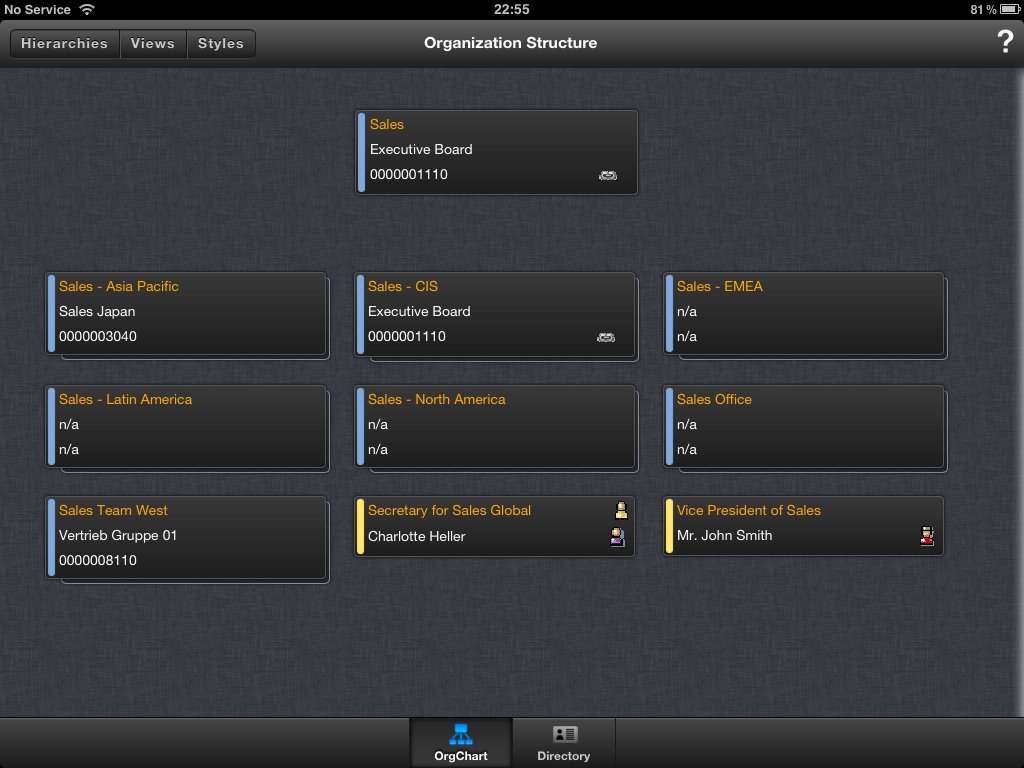
There are two options under ‘Hierarchies’ (on the Demo system); Organization Structure and Position Hierarchy. The first option will chart the organisation as organisational units and the positions within those units. The second option will display only positions in the reporting structure. So the first option maps the way the organisation is structured whereas the position is maps the line reporting hierarchy.
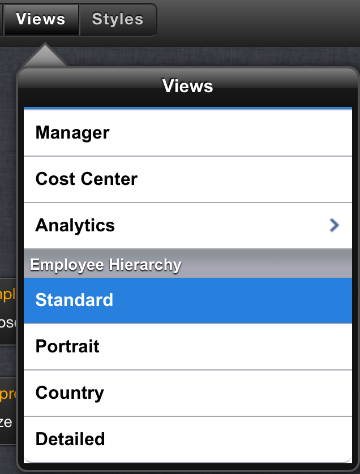
The second menu is Views. Views determine what data is shown in each type of box of which there are three types: organisational units, positions and employees.
Out of the box, OrgChart includes an org structure with employees but it is quite common to disable this and just use the generally more meaningful org structure with positions. This hierarchy doesn’t appear to be enabled on the Demo system, so if you do want to see the employee boxes and respective views you might want to detour to listings to do so (there’s a screen shot with them in later on though).
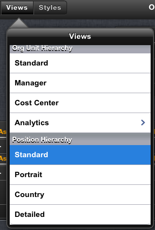
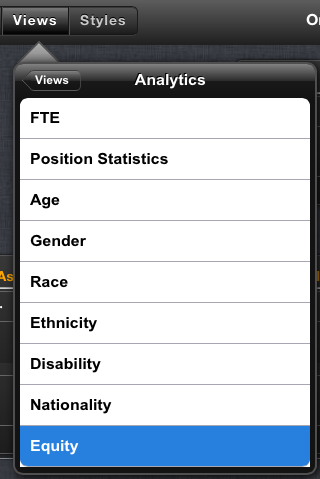
Notably the views menu also has a sub menu of analytic based views.
The final menu is Styles and this determines the way in which the chart boxes are laid out.
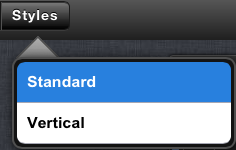
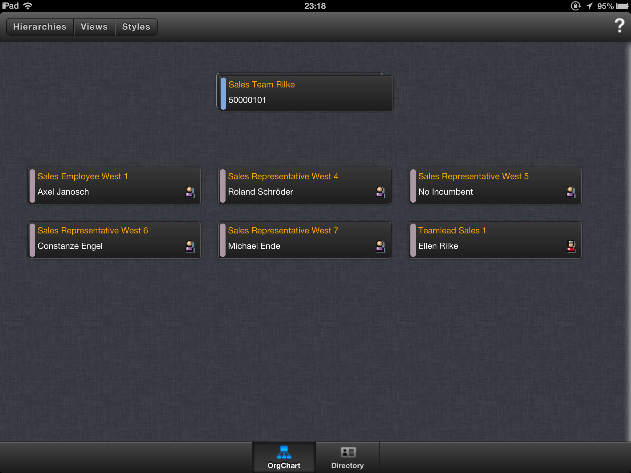
The first option, standard, places the root node in the top third of the screen. The nodes one level down in the hierarchy is then laid out in a grid in the bottom two thirds of the screen. This bottom section may be scrolled up and down if there are too many nodes to be drawn on screen.
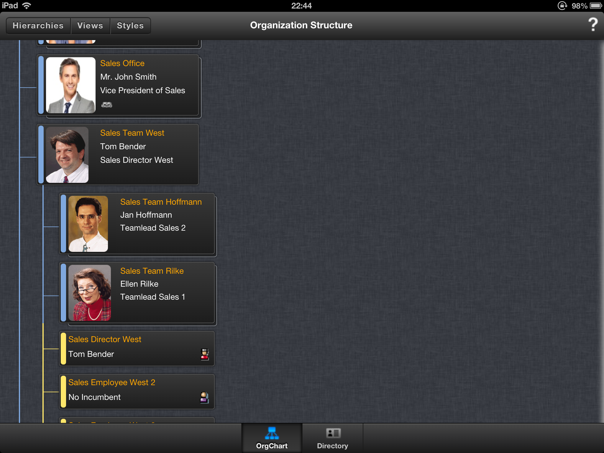
The second option, vertical, draws the boxes in a tree hierarchy (with connecting lines) and is able to be expanded to show multiple levels of the hierarchy.
The screen shots below show a variety of hierarchies, views and styles.
Standard style Org Structure hierarchy with cost centre view for org units and standard view for positions.
Vertical style for Org Structure hierarchy with manager view for org units and standard view for positions.
Standard style Org Structure hierarchy with cost centre view for org units and standard view for employees.
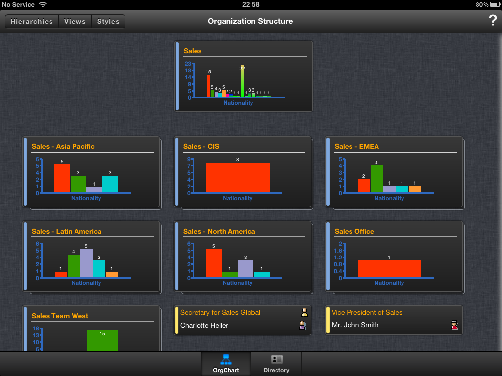
Standard style Org Structure hierarchy with nationality analytics view for org units and standard view for positions.
Standard style Position hierarchy with country view for positions.
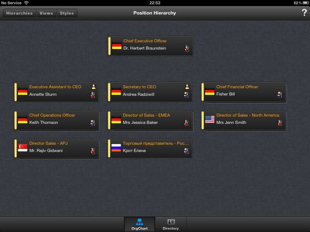
Standard style Position hierarchy with Detailed view for positions.
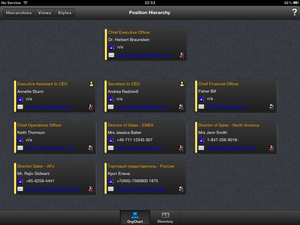
This last screen shot is particularly interesting as it shows the contact details for the position’s incumbent. This includes both the telephone number and the e-mail address.
Nakisa have certainly been active in tweaking this release in the past few days as the e-mail addresses are now ‘active’ If you tap on an e-mail address anywhere in the application it will leave the OrgHub for Mobile application and open the Mail application; pre-populating the e-mail address with the one selected.
It would be good to see the addition of some way to trigger telephone calls added in the future (Skype is a VOIP application capable of this for example). This may be keyed more towards any future iPhone development where there is a built in cellular app for making telephone calls.
There is of course a limit as to how much you can fit into a box in a chart and this is where the details panel comes in. By selecting a box (or an item in a listing as you’ll see later), you can open a panel on the right hand side of the screen.
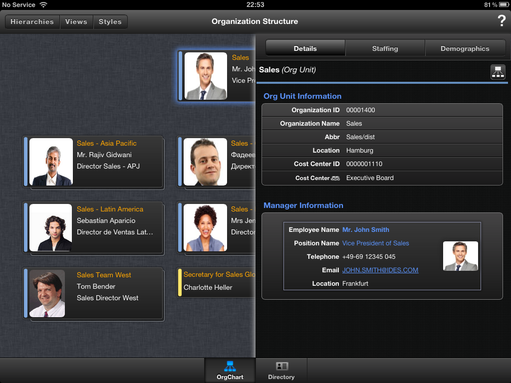
The details panel has up to three separate sets of data each indicated by a button at the top of the panel. These equate to the tabs you would see in OrgChart and so for the sake of parity I’ll refer to these as tabs (otherwise I’m going to start having to reuse terms like view or panel).
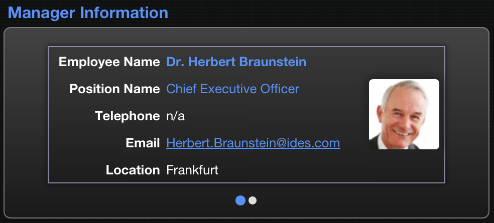
The Details tab provides basic details about the box selected. The exact data content varies depending upon the type of object selected and of course any customisation that may have been carried out on the panel in OrgChart. In the Nakisa Demo system the content is of course standard out of the box stuff.
In the screen shots above and below you can also see that data of related objects can be incorporated - e.g. the manager of the org unit and the incumbent in the position.

In both instances you should also be able to make out a button in the top right corner that looks like a small org chart. Clicking this will open the relevant hierarchy to view the object in-situ within the hierarchy.
The position details panel also includes an organizational silo report section which shows the position within a branch of the org hierarchy and down to the employee(s) holding the position.
If there are instances where there are multiple incumbents you’ll see dots just like we did in the help. Swiping left and right will change the information shown.
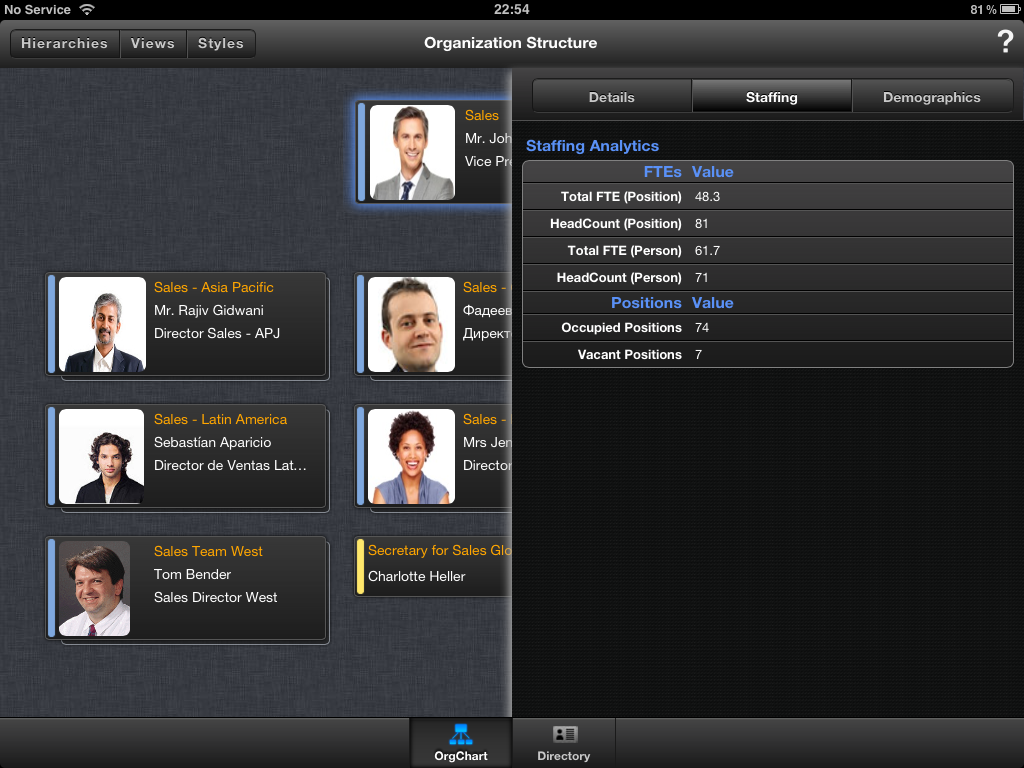
The second and third tabs are available for org units and only to users who have the requisite permission to view them. This might typically restricted to universal access to key HR staff and executive teams, and access to own org unit and below for managers. The two tabs show Staffing and Demographic information for the org unit and the org units beneath it.
The Staffing tab gives details such as head count and full time equivalent (FTE) for the org unit and all org units from that point down in the structure.
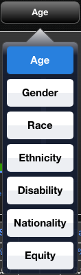
The Demographics tab offers a wide range of information about several demographic areas (including age, disability, equity, ethnicity, FTE, gender, nationality, position statistics and race). To change the demographic view, tap on the Demographic button on the right of the demographics description and select a demographic from the drop down menu.
Like the staffing information this is available both for the org unit and for the org unit and below - simply swipe the panel left/right to move between the two sets of information.
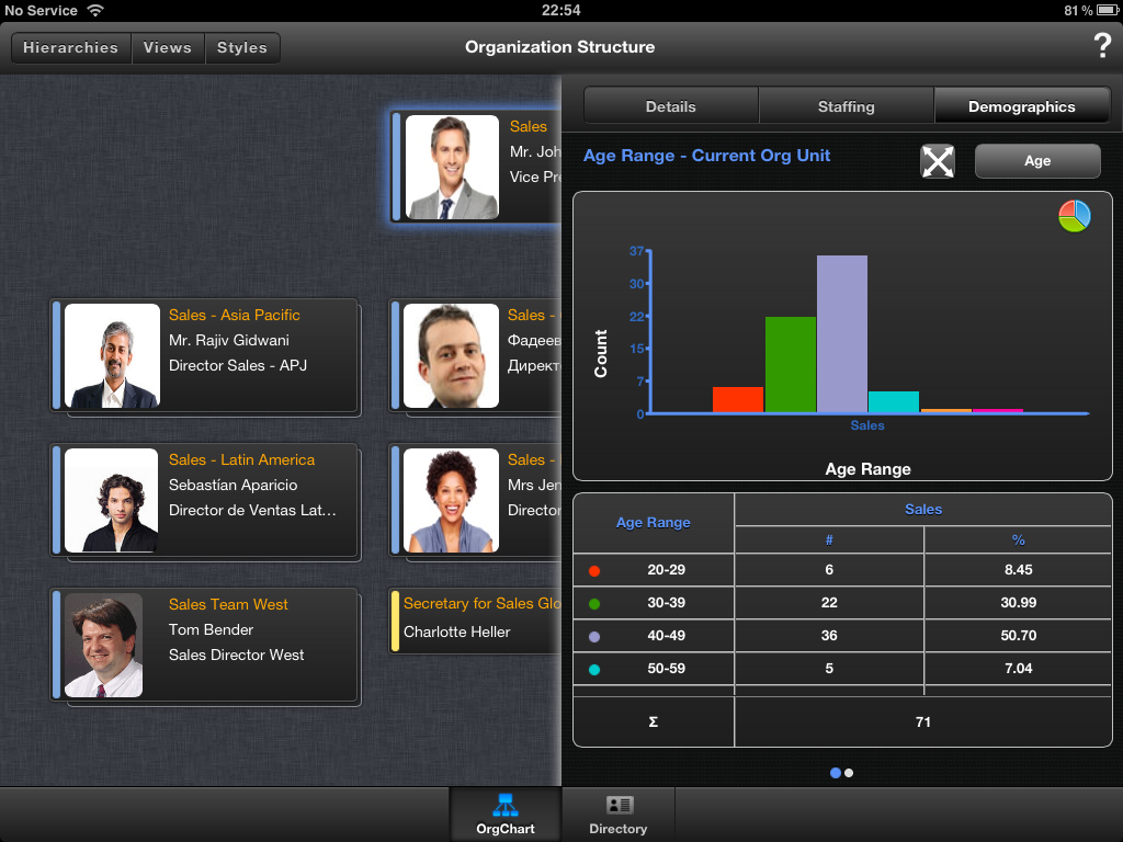
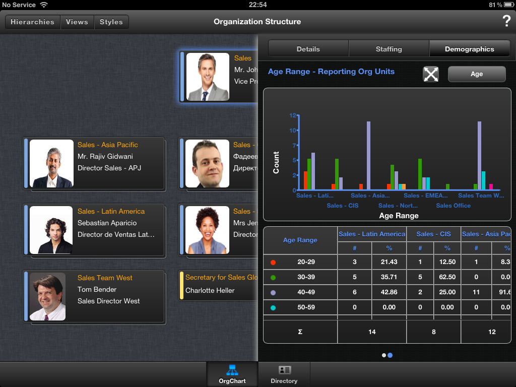
Demographics are displayed as charts (you can switch between bar and pie charts by taping on the chart symbol (see the first screen shot of the pair above)) and tables, with the exception of Equity which only uses tables.
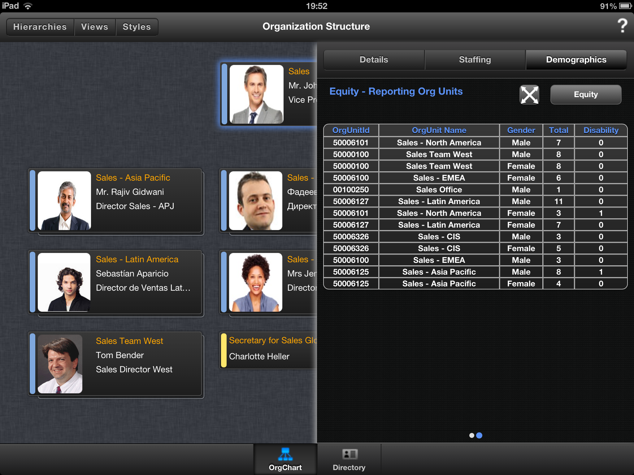
Where a table is too large to fit on the panel, you can scroll left/right and up/down by swiping within the table area. It isn’t always immediately obvious that the table has content that can be scrolled, but if you check the rows against the number of corresponding colour coded entries in the chart and review what is actually shown it’s usually immediately obvious. However there is a better solution for this….
The Staffing and Demographics tabs can also be viewed full screen rather than in a details panel. To enter full screen mode tap on the button next to the Demographic button. It has two double-headed arrows on it in the shape of a cross.
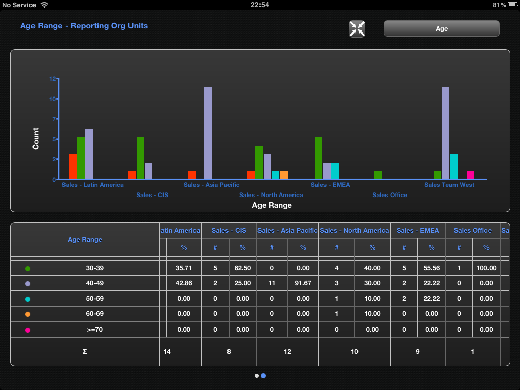
To exit the full screen mode tap on the button with four inward pointing arrows in the shape of a cross.
Searching Using the Directory
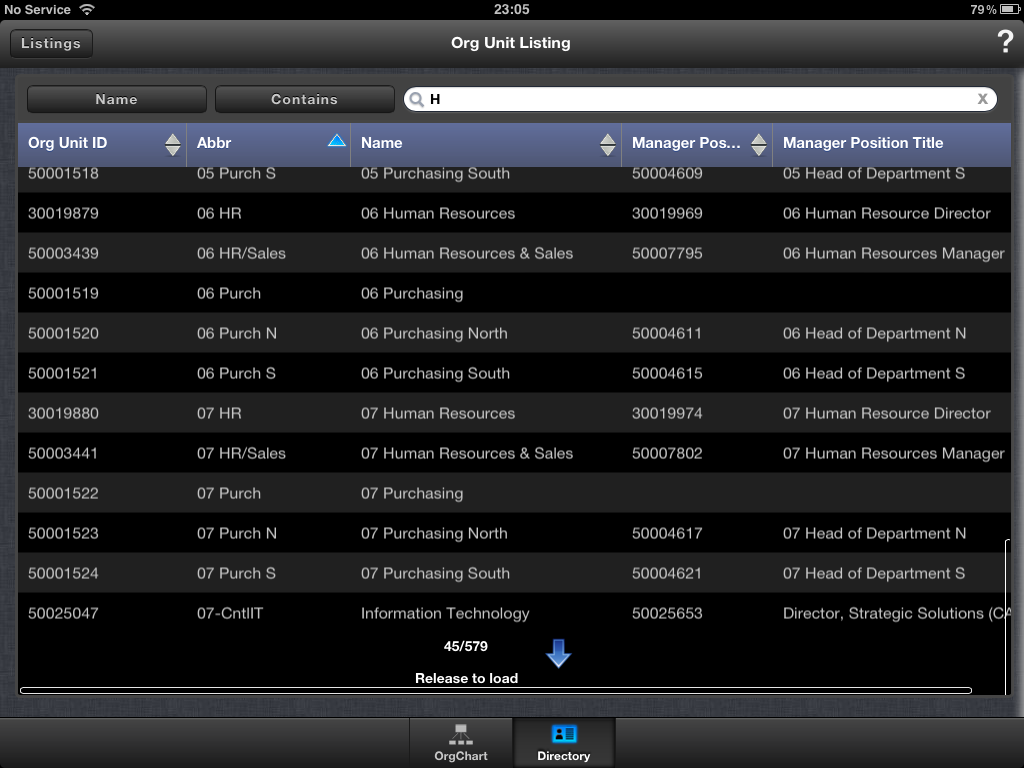
The second part of the OrgHub for Mobile application is the Directory. This is accessed by tapping the Directory button at the bottom of the screen. The directory allows you to carry out a basic search against one of a set of parameters (unlike the OrgChart application whose listings also offer the option of advanced searches where multiple parameters can be specified).
In the Demo system there are three listing options available - employee, position and org unit. The type of listing to be used can be selected by tapping on the listing button in the top left of the screen and selecting one of the options from the drop down.
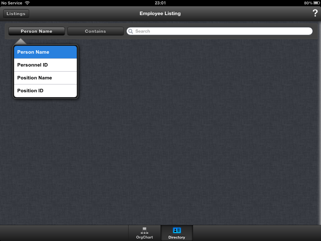
For each listing, there are two further buttons to tap that will reveal menus of options. The first allows you to select the property you wish to search on (e.g. the name of an employee or the cost centre of an org unit), the range of fields available varies between listings. The second button allows you to select the type of match to be carried out. This list will be aligned to the type of field and allows you to search based on matches such as ‘equals’, ‘begins with’, ‘ends with’ and ‘contains’.
After specifying the property and type of match simply enter some details into the ‘search’ field (next to these two buttons) and tap return to carry out the search.
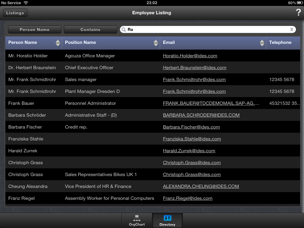
When the search completes a tabulated listing is displayed. Each row represents an object matching the search and each column in the row displaying a property of the object.
By tapping on the column header you can (for any column set in the OrgChart configuration to be sortable) sort the results. Tapping on a column header twice will reverse the ordering.
The listing will display thirteen rows on screen but loads in a ‘page’ worth of results - a setting that’s specified in the OrgChart configuration and in the Demo system is set as 15 rows. Scrolling up and down as well as side to side is available (by swiping up/down/left/right) and when you reach the bottom of the listing (i.e. the 15th row) you can then pull the scroll down (i.e. swipe up) and release to add the next ‘page’ of results. The previous pages stay available - you don’t need to reload them. It is also worth noting that scrolling down to the bottom in this way tells you how many results your search returned in total. Even with hundreds of results loaded, performance still seemed to be really snappy.
Tapping on a row will open a familiar looking details panel for the specific type of object. Just make sure you don’t tap on any e-mail addresses otherwise it will also jump you out into the Mail app.
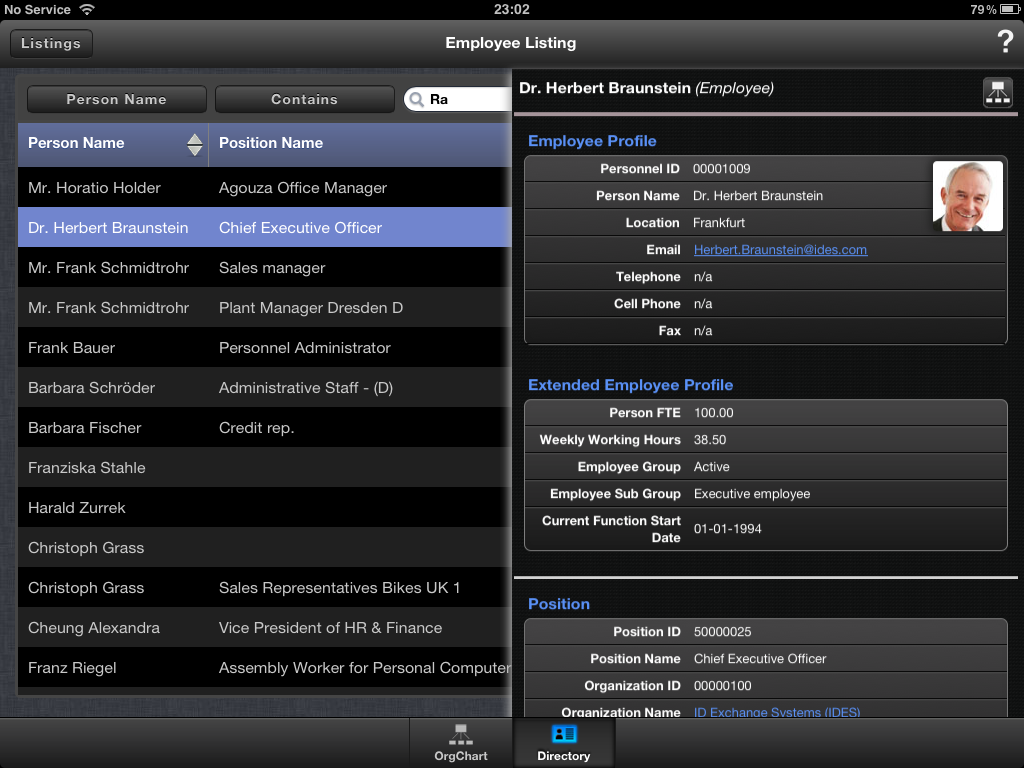
Again tapping on the button with an org chart icon on it (top right) will open a hierarchy to display the object. This will effectively take you out of Directory and back into OrgChart. At the same time it will hide the details panel, but you can always get it back by tapping on the corresponding object in the chart or swiping the details panel back into view using the gestures described earlier.
Just one more thing
In true Columbo style there’s just one more thing I’d like to raise regarding OrgHub for Mobile before you start deploying it to all and sundry; and that’s around data security. Some HR data available via OrgChart is rather sensitive so you really need to be sure you’ve got tight controls in place when you let this data out onto mobile devices.
1. VPN
Whilst it is probably a given that you will use a VPN for any access external to your corporate network there are a couple of specifics that you’ll need to ensure are in place.
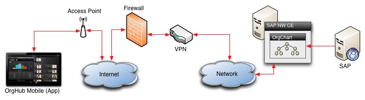
The first is that the VPN you have is iOS compatible. Different protocols and authentication factors are used for different VPNs and not all will work seamlessly with an iPad - particularly if the VPN is a little long in the tooth. So you’ll want to double check that any current VPN solution you have in place will cater to your needs.
Secondly if you’re going to use the application on any internal corporate WiFi networks (rather than an external network), you’ll need to ensure that the traffic is routed accordingly. Without this routing you can end up with a system that you can only access (from your iPad) whilst you’re not directly on the corporate network.
2. Profiles
Sometimes people lose their mobile devices (forgetfulness, theft, etc.) and since there is a potential for someone with access to the device to get to your HR data there needs to be some safeguarding in place.
Unfortunately the OrgHub for Mobile application doesn’t apply any restrictions itself beyond putting in your credentials at set-up. Whilst there is an option to enable or disable auto-logon, most users will simply set it to auto-logon not giving any consideration to the security of the data.
This means that you need to consider doing something extra to secure the device itself.
The simplest solution with iPads is to add a pass code to the lock screen. This will force the user to enter a code in order to unlock the device. Of course if you don’t somehow constrain the settings, users will have the option to disable this ‘pesky time-wasting annoyance’ and what about the deluge of ‘bring your own’ devices (BYoD)? After all you don’t configure people’s personal devices for them (well I guess based on experience it might depend upon how nicely they ask).
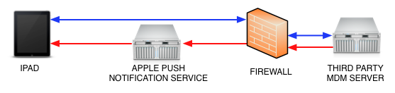
The solution fortunately is to use something relatively straight forward. Apple allows you to push configuration profiles out to devices via Mobile Device Management (MDM) systems and Apple Push Notifications. This allows you to apply a constraint to any iOS device that wants to connect to your network.
This will also enable you to remote wipe the device should it be lost further securing against the potential for someone to gain access to your data.
Securing iPads in this way should be part of the organisation’s mobile device policy (including BYoD). If however, all else fails, changing the password on the account used by the user to access OrgChart will effectively disable access via OrgHub for Mobile on that user’s lost iPad.
Conclusion
So that’s my whirlwind tour of the new OrgHub for Mobile application from Nakisa. It offers a broadly similar set of functionality to OrgChart on which it is effectively built, and it does so through an easy to use and beautifully designed mobile interface. Overall I don’t think the inability to perform more advanced searches in Directory or to export charts, listings and ChartBooks (as OrgChart allows) detract from the application. To be honest simplicity for mobile just seems more elegant.
In fact ‘elegant’ is probably the word that best sums up my feelings about this application. It’s definitely received the caring touch in polishing some rough edges I noticed in the initial App Store release. I’ve even tried running the application on a 1st and a 4th generation iPad and the difference in performance and responsiveness is minimal. This could be in part to processing done on the server side, but in any case the delivery to the end user is what counts and it is slick!
I’m sure there will be further iterations of the iPad app and I hope to see some triggering of creating e-mails and maybe the option to export a current chart to the standard Photos application in a future release. Nakisa have suggested in webinars and the like, that other platforms are in the pipeline and since there’s an HTML5 foundation to this application I would imagine that similarly elegant applications for other tablets won’t be too far down the line.
As for smaller devices (e.g. smart phones) I would hope that there is some sort of development plan for them too. I would imagine that the Directory could be useful for many when trying to work out who to call or e-mail based only on knowledge of what area they need to contact. Viewing a hierarchy is obviously somewhat trickier, but there’s a basic solution in SuccessFactors’ BizX Mobile application and having seen the iPad app from Nakisa I’m sure they could come up with something more functional.
Some of the screen shots from presentations also show what were presumably semi-functional mock-ups with buttons for social & communications networks such as LinkedIn and Skype. It would be great to see integration where you could link out to other apps or information sources; in fact this seems like it would probably just be part of the mobile implementation for OrgChart’s SocialLink module (SocialLink integration in OrgHub for Mobile is thought to be coming).
From an implementation perspective I think it would be useful to have some control over the help screens and maybe the ability to add some corporate branding to the application (e.g. initial loading screen, help screens). Perhaps even some diagnostics or logging to help debug connection issues. In time I hope that we’ll see some really great case studies around implementations that cover not only the Nakisa side of the equation, but also the infrastructure side (particularly with regards to security).
If you do have access to an iPad I’d really recommend you try this application out for yourself. I think you’ll be more than a little impressed with what it offers!
If you do try it out or have any thoughts about what you’ve read here please feel free to leave a comment.
Further Reading
Whilst it is a new piece of software, there are a number of additional resources I’d recommend taking a look at to learn a bit more about this application.
- OrgHub for Mobile announcement, Nakisa
- OrgHub for Mobile video, Nakisa
- Nakisa OrgHub for Mobile (A high level overview), by Luke Marson.
- Visualization Solutions by Nakisa 4.0, Nakisa
- SAP Org Visualization, Nakisa
- Apple App Store - OrgHub for Mobile, Nakisa
- Virtual Private Network (VPN), Wikipedia
- Mobile Device Management in iOS, Apple
- iPad Security, Apple
- iPad Enterprise Deployment Support, Apple